Until January 4 2015 the Stedelijk Museum Amsterdam is exhibiting about 200 paintings and drawings of Marlene Dumas. You might ask yourself why this appears on a photo blog. No, it has noting to do with Marlene’s daughter, Charlotte Dumas, who’s a well-known photographer. I’ll explain the link to photography in a minute. What really triggered me to write this post, was the media coverage the exhibition received. All national newspapers and television shows, without exception, were so extremely positive and lyrical about Dumas’ work, that it simply begged, in my opinion, for some criticism. Is it really that good?
All critics praise the multiple layers in her work and, as a viewer, you can almost feel the struggle Dumas went through during the painting process. Now everyone is entitled to his or her own opinion, of course. I don’t have a problem with that, but let’s have a closer look at the way Marlene Dumas works. To begin with, she has a huge archive of all the photos she collects (so here’s the link to the photo blog). To quote the museum’s website on her workd: “Dumas often finds inspiration in newspaper and magazine images from her immense visual archive. The artist believes that the endless stream of photographic images that bombards us every day influences how we see each other and the world around us. Dumas addresses this onslaught by revealing the psychological, social, and political aspects of these images. Her drawings and paintings have an enormous directness and expressiveness, which the artist couples with a certain analytical distance.” Fair enough, she finds inspirition in the images she sees in the press every day. In my opinion, she translates this inspiriation in a simple, straightforward copy of the image. Again in my opinion, she adds very little or nothing to the original. This makes it that one artist (Dumas) copies the result of another artist’s (the photopgrapher) creative process. Before the photographer took the picture, there was nothing. By taking the picture – and by making decisions on composition, light, aperture, shutter speed, et cetera to achieve a certain effect – he or she went through a creative process that produced the photo. This makes the photographer the creator. Now, Dumas takes this image as is and, without adding anything to the composition, light or colours, reproduces it on canvas. It is the same as if I would take a picture of a sculpture, for instance. The sculptor had something in mind when he started with it, a certain pose or expression on the face or whatever, and created it. My picture of it would be nothing more than a copy of his/her creation.
Compare the Dumas’ paintings Dead Marilyn (2008) and The Pilgrim (2006) with their photograpic equivalents and you will see my point. The paintings resemble the originals in so many ways that I have trouble understanding the enthusiasm of the critics.
I didn’t receive written permission to use images of Dumas’ work, so I’m afraid you have to do a bit of research on the internet yourself here.
It’s very common that artists are being inspired by other artist. There’s nothing wrong with that. But the inspired artist adds an extra element that gives it his or her work its own style and makes it unique, its own signature so to speak. The work of Dumas, however, resembles the original too much, in my opinion. It lacks the originality of the photo, it adds too little (I expect many critics to disagree with this statement) which makes it more or less a straightforward copy, only using different materials. Well, that’s my two cents anyway. Again, everyone is entitled to his or her own opinion. If you like, adore, worship Marlene Dumas’ paintings and drawings, so much the better. If you do not or don’t know, go and visit the exhibition at the Stedelijk and judge for yourself.
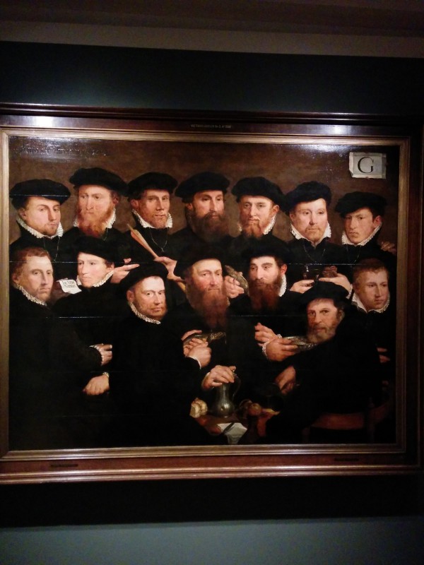
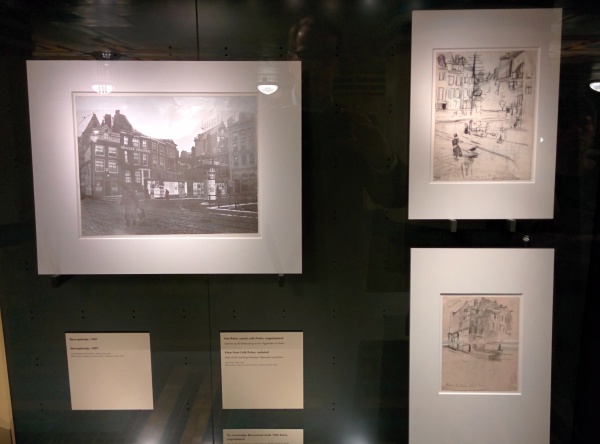
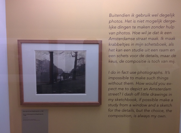
Update: Stadsarchief Amsterdam (City Archives) is doing an exhibition of the work of 19th/20th century painter George Breitner. He used the upcoming photo-technology a lot as a source for his paintings. I’ll visit the exhibition and report on it on the next post on this blog.


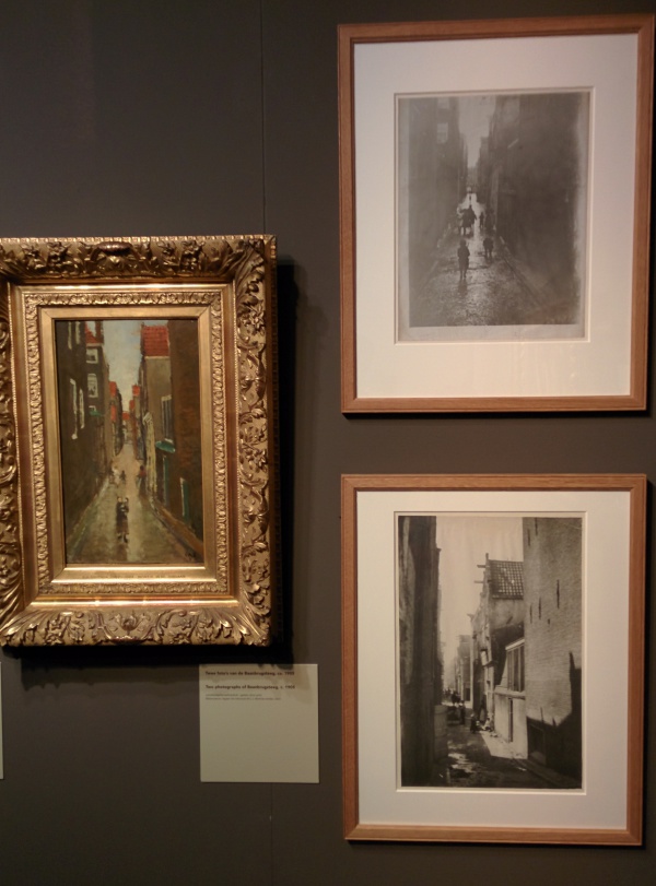
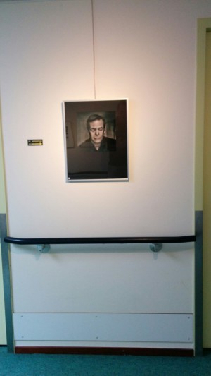
![IMG_20140823_132348[1]](http://www.reiniervanhouten.com/wp-content/uploads/2014/08/IMG_20140823_1323481-e1408966929681.jpg)
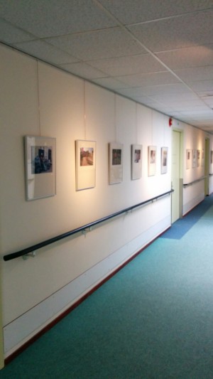
![IMG_20140823_123312[1]](http://www.reiniervanhouten.com/wp-content/uploads/2014/08/IMG_20140823_1233121-e1408967813695.jpg)