In my photography endeavours so far, I haven’t given the area of colour management very much attention. Sure, I do have a colorimeter and I do calibrate my monitor “every now and then”. But that’s as far as it goes, I’m afraid. I’m not very in to it and I’m satisfied with my results. I don’t receive any particular criticism when it comes to colours. So, in general, no good reason to do anything about colour management, but I happened to be talking to one of my fellow cameraclub members, the other day, and he asked me if I was using X-rite’s ColorChecker. Told him I wasn’t, but used it once during a workshop I attended a couple of years ago. Never bothered to use it afterwards, because it didn’t fit into my workflow in those day and would force me to convert all my images to Adobe’s DNG format. Didn’t want to do that and never really gave it much thought since then.
However, his question triggered me. My workflow has changed and Lightroom, which I use these days in combination with the Nik Collection, has a very nice integration with the ColorChecker software that doesn’t require DNG to create new colour profiles. So, without any further ado, I ordered my ColorChecker. For those who are unfamiliar with the product, have a look at www.xrite.com or go to one of the many tutorials on YouTube. In one line: it allows you to calibrate your camera. Used in combination with a calibrated monitor, you can rest assured that the colours at the time of the shoot are the same as when doing your editing on the PC.
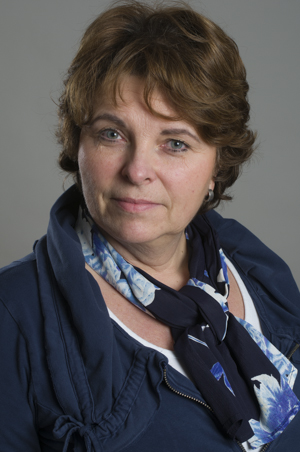
Below are the results of my first ColorChecker shoot. It all depends on how “colour capable” the monitor is you’re viewing this website on, because the differences are subtle. Going clockwise, the first image is uncorrected. Using the wite balance colour temperature “as shot” and “Adobe Standard” colour profile. The seconds one has only the white balance corrected. It was 4.600 “as shot” and ColorChecker increased it to 5.100 giving better skin tones and overall slightly warmer colours. The third one uses both a white balance of 5.100, plus a newly created colour profile (.icc file). To me, this one is over the top with too much colour saturation. Number four has the white balance colour temperature set back to the original 4.600 and the newly created colour profile applied. As far as I can tell, this is the best combination.


So from now on, all my studio shoots will have at least one image with the ColoChecker device present for each distict lighting setup. During editing with Lightroom I will create a profile for the lighting setup and use it for all subsequent shots. Sounds like a lot of work when you describe it like this (and that’s why I never bothered probably), but in reality it’s quite easy. For more accurate colours it’s worth it.
With a calibrated camera and monitor I have colour management covered. Almost. Who said printer…?